Visualizations
Hyperquery ships with a powerful visualization editor, capable of series breakouts, aggregation, type coercion, and more!
A quick overview of our visualization capabilities
Full overview of features
Chart type
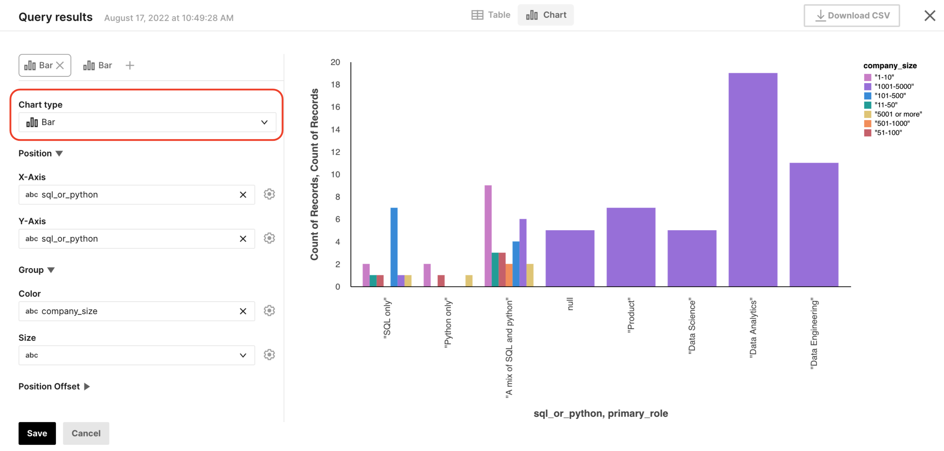
The chart type enables you to select what kind of plot to make. We have three options - line, scatter, and bar. From these basic chart types alone, you can also make histograms and vertical bar charts.
X-axis and Y-axis
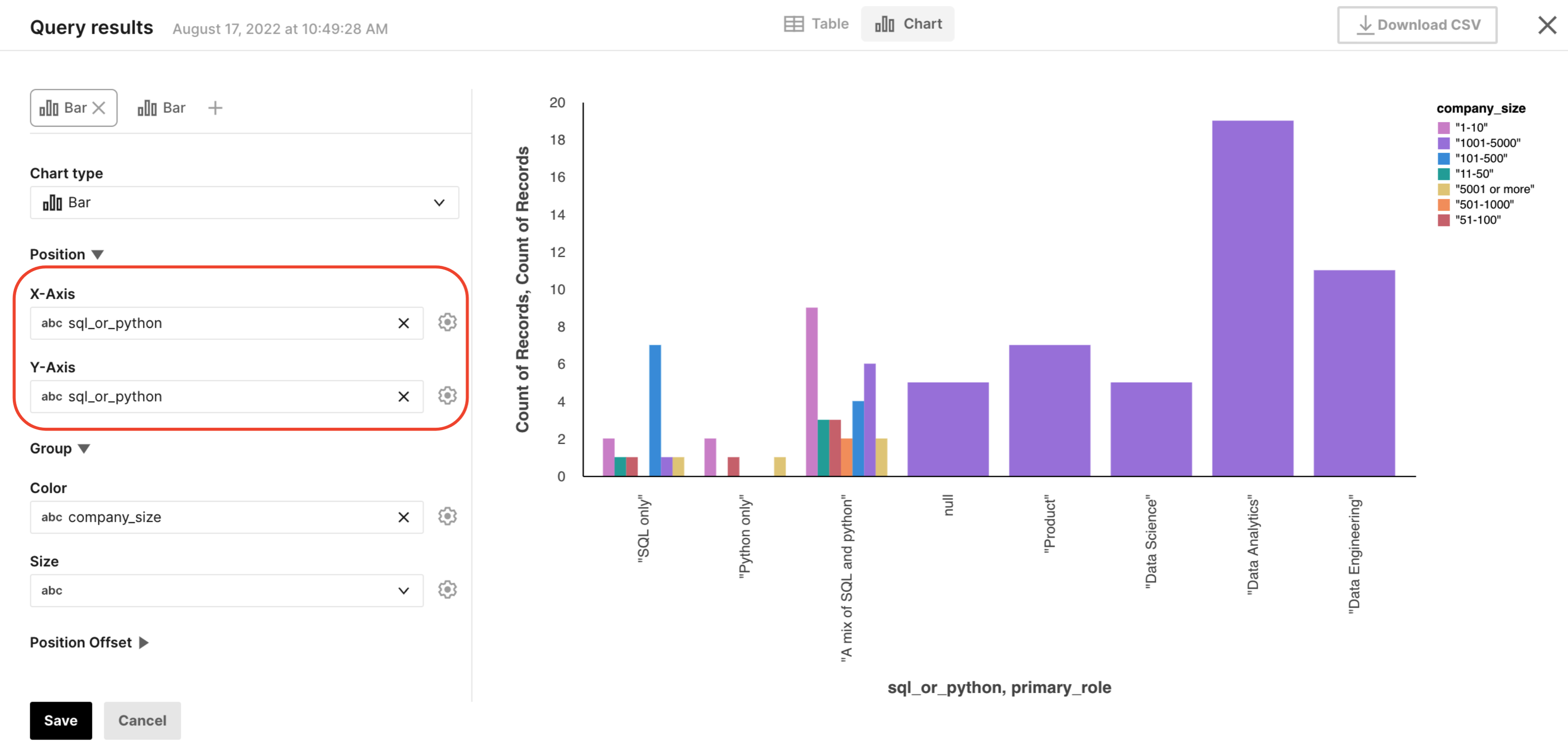
To create a plot, the first thing you'll want to do is specify what data goes on the X-axis and what data goes on the Y-axis. To ensure that the data is visualized correctly, you can click the gear next to the dropdown menu and specify the type of the field and add an aggregation, if desired.

Type
There are four possible types that you can coerce a column to, by pressing the "gear" symbol next to any field:
- Quantitative: numbers.
- Temporal: dates and times.
- Ordinal: a categorical variable that is ordered.
- Nominal: a categorical variable that can't be ordered.
To learn more about these types, read the official vega-lite documentation.
Aggregation
We allow you to perform some pre-processing of your data before visualizing it, again accessible by pressing the "gear" symbol next to any field. We support:
- Count: The total count of data objects in the group.
- Valid: The count of field values that are not
null,undefinedorNaN. - Missing: The count of
nullorundefinedfield values. - Sum: The sum of field values.
- Mean: The mean (average) field value.
- Min: The minimum field value.
- Max: The maximum field value.
Read more about these options in the official vega-lite documentation.
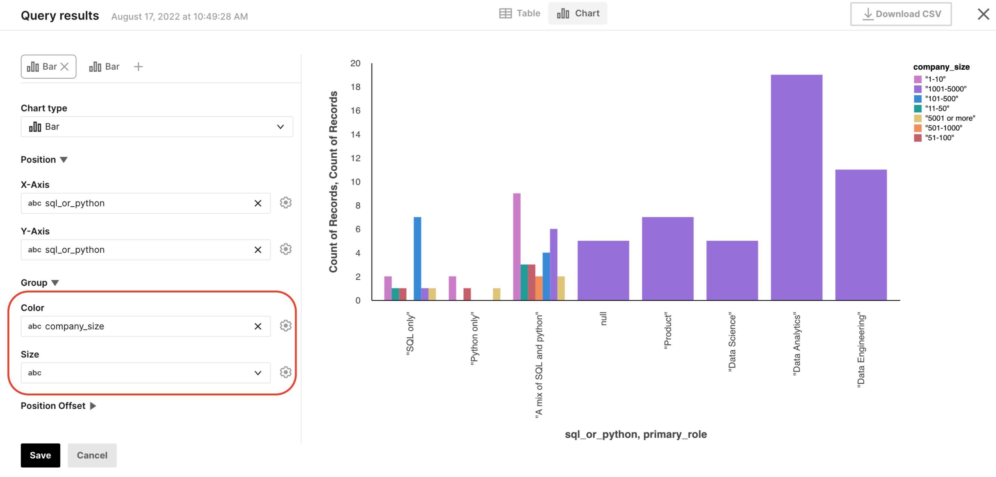
Groupings
We allow you to specify groupings (commonly known as "[series] breakouts" in other tools, or "Mark Properties" in vega). These allow you to group your X and Y values by the specified field, then modify a property of that plot to show these groupings. We allow for two grouping types: color and size.
X-Offset and Y-Offset
If you'd like to customize the X or Y-offset of values according to a particular column, you can do so with our "Position Offset" feature. In our experience, this is primarily valuable for unstacking bar charts. To do this, you'll want to simply select the same column that you use for your grouping (generally color) field in the offset field.
Learn more here: Offsets
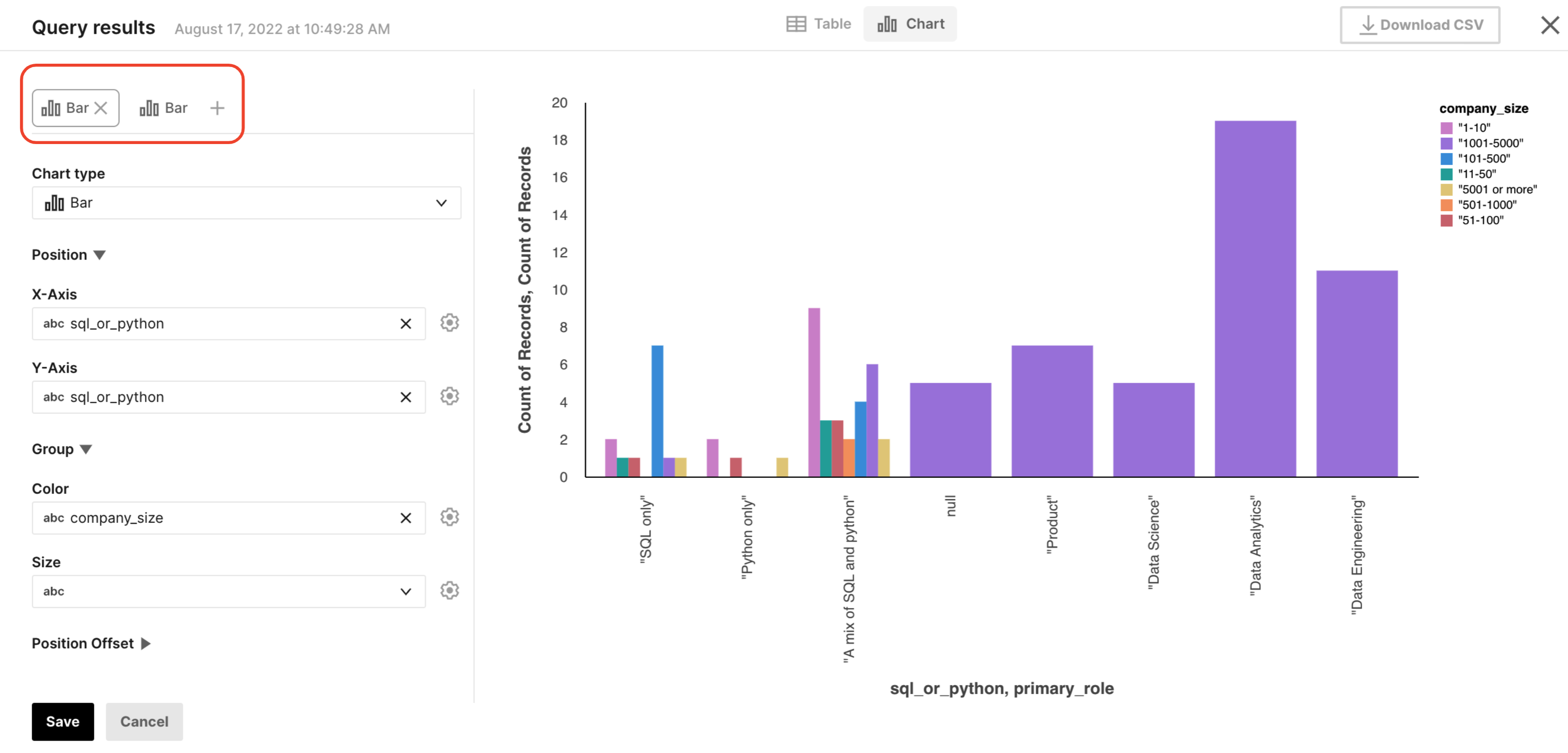
Layers
If one plot is not enough, you can also add additional layers to your plot, enabling you to superimpose different data sets within the same set of axes.
Learn more here: Layering views.
Updated about 2 years ago