WYSIWYG and friction reduction
This is the first of our Hyperquery Philosophy series, where we discuss our core, philosophical product principles and how they've led to specific design choices we made in our product.
Product principle: reduce friction, increase compliance
High friction leads to non-compliance.
And in analytics there are two pathways that we believe desperately need reduced friction:
- ✍️ Creation of shareable analyses.
- 👩🏻🏫 Consumption of said analyses.
In this post, we'll talk about each of these in turn, then discuss how we made the decision to make our notebook truly WYSIWYG to account to help lower the friction in taking these actions.
The state of the world: high friction creation ✍️
When I was at Airbnb, I felt I had a reasonable pathway for sharing my analytics work. I had a template in Google docs that ensured I clearly laid out the objective of my analysis, the key findings, and my recommendations. For my longer-form projects, this would work well -- I'd spend a few weeks on the analysis, then spend another week or two cleaning my results, writing up my findings in a digestible way, adding in all supporting technical work, and sending it out in an email.
Unfortunately, I only had enough bandwidth to do a few of these a year, and so most of my work went unpublished, left to decay in tabs in my IDE or disappear within my swarm of local notes. This would've been fine if the things I wrote up were the most impactful things I'd done, but often the most impactful and transferable pieces of work were those that I didn't think would be valuable.
And my blocker wasn't laziness -- I did write up my own notes around my queries. I even wrote notes for myself that indicated how these learnings might transfer to other teams. But few of these were shared. The problem: while it wasn't hard to make shareable work, it was too hard to do it all the time, meaning I shared very little of my work.
The state of the world: high friction consumption 👩🏻🏫
Making readable work is only half the battle, the other half is actually getting others to not only read, but interact with it.
At best, if I wrote up my work in a highly accessible Google doc, folks would comment on it. But even in that scenario, they'd never consider executing the queries themselves or dipping their toes into the exploration in any meaningful way -- there was a hard line barrier between what was presented and the underlying technical guts. When I tried to bridge that gap with a Jupyter notebook, I'd notice it'd never get read -- stakeholders were too afraid of messing something up.
And at worst, I'd share a visualization or a SQL snippet in Slack, and the collaboration would effectively fizzle out there. A quick "thanks, Robert!", followed by nothing. I'm certain my stakeholders took the SQL and generally did nothing with it. And when I'd probe around and ask whether it helped, I'd often find they just had excuses -- "oh I haven't had a chance to look at the query yet" -- or vague comments to spare my feelings ("it was really helpful"). And it became clear to me that they needed more. They needed context, they needed a place to ask questions easily, they needed clear pathways to reproducibility -- not obscure, headless artifacts.

WYSIWYG
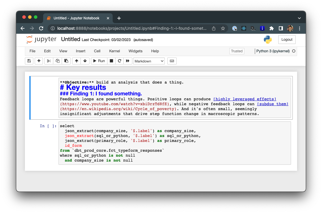
When we started Hyperquery, we had an option: we could build on top of Jupyter, which already sports semi-WYSIWYG markdown cells, or we could build something truly WYSIWYG. But we'd been down that road before -- we'd seen hosted Jupyter notebook solutions before and knew that their inherent technical complexity limited how well they could conform to analytics collaborative pathways. They were scary for stakeholders, so stakeholders would only sometimes read them, and never interact with them, for fear of breaking things. But they were also heavy for most analytics work, meaning we'd often revert to our IDE for the bulk of our work. Not enough work got shared, and not enough of the shared work got read.
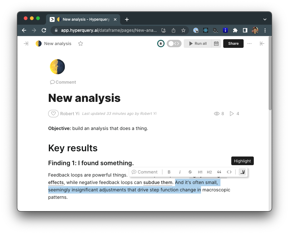
So we made the extremely difficult decision to rebuild a new notebook from the ground up -- one that's text-first, not code-first. If you hadn't noticed, we were inspired by the seamlessness of WYSIWYG editors like Google docs, Notion, or Roam. We are fundamentally a notebook, like Jupyter, but rather than making narratives subordinate to the code, we've made the code subordinate to the narrative.

It was a simple shift, and on the surface of it, it seems like we just made Notion with code blocks. But this was a decision that caused us extreme agony -- there are often many ways to solve a problem, and we were uncertain whether the technical cost of rebuilding the whole thing from the ground up would be worth the UI benefit. In product development, it's often not so much a question of coming up with an idea, but figuring out how to allocate your precious resources across a number of different ideas, particularly when open source libraries like Jupyter can drastically reduce your time to market.
Updated 12 months ago
